The goal was never to change what makes these businesses good. It was to make that easier to see, easier to find, and easier to book.
Proof · Three clientsBirch & Willow · The Groomed Goose · Clarissa Rene Hair
Before + after
What changed, and what didn’t.
The goal isn’t to change what makes the business good. It’s to make that easier to see online.
same brand, same owner
Before
After
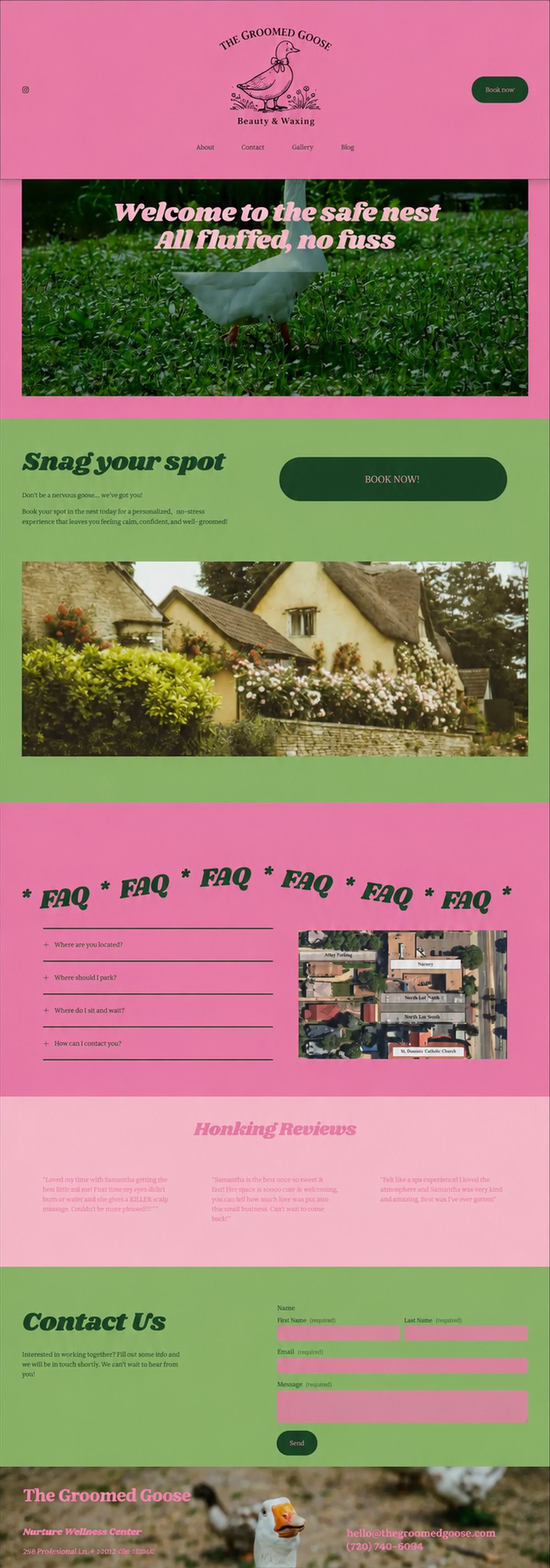
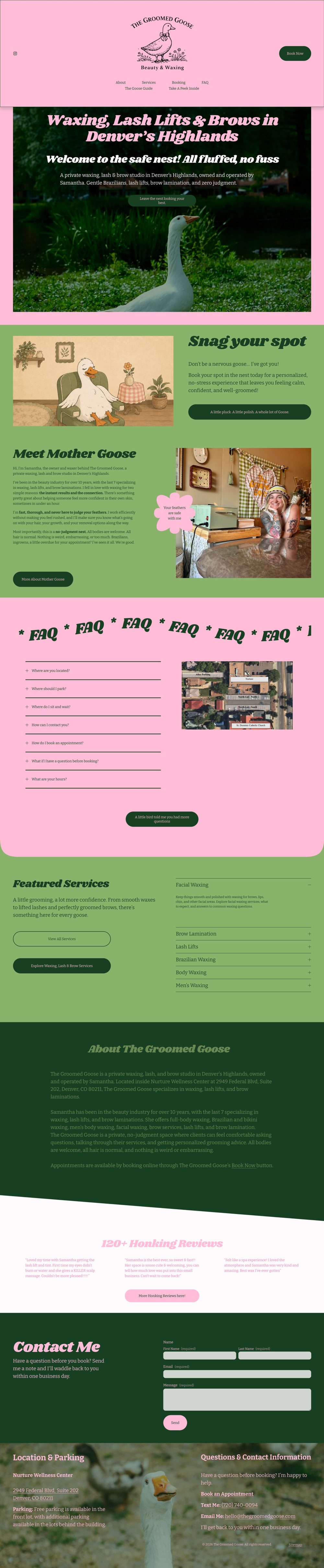
The Groomed Goose · Denver Highlands
A perfect five stars, 119 Google reviews, and an incredible brand 🪿. The internet just couldn’t tell what the Groomed Goose actually did, only that it had a killer brand presence. Now the homepage says waxing, lash lifts, and brows in the first breath, introduces Samantha by name, and puts the honking reviews where nervous first-timers can find them. The personality and visual style stayed exactly as they were, and the UX, SEO, and AI search all got better underneath.
same studio, clearer welcome
Before
After
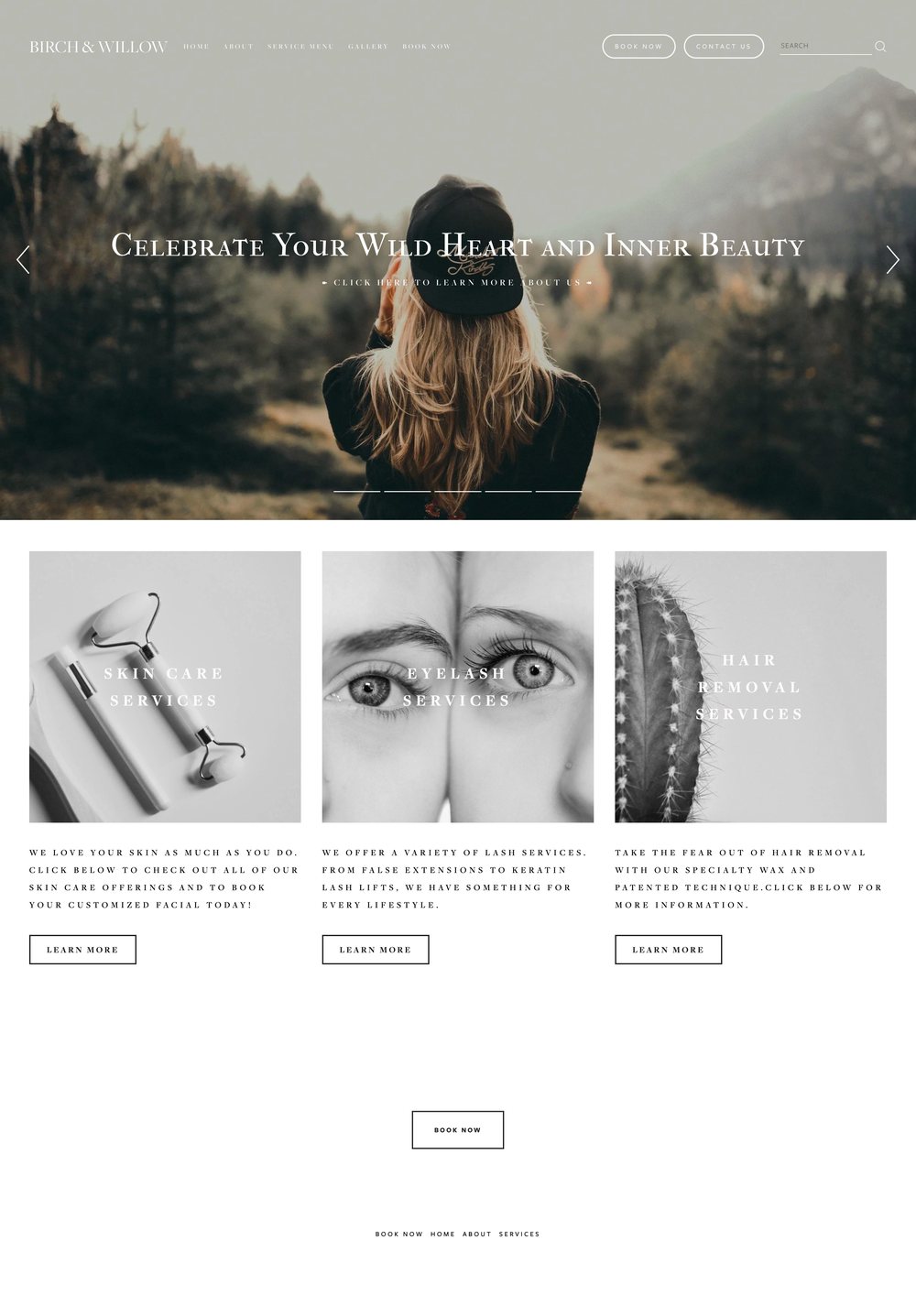
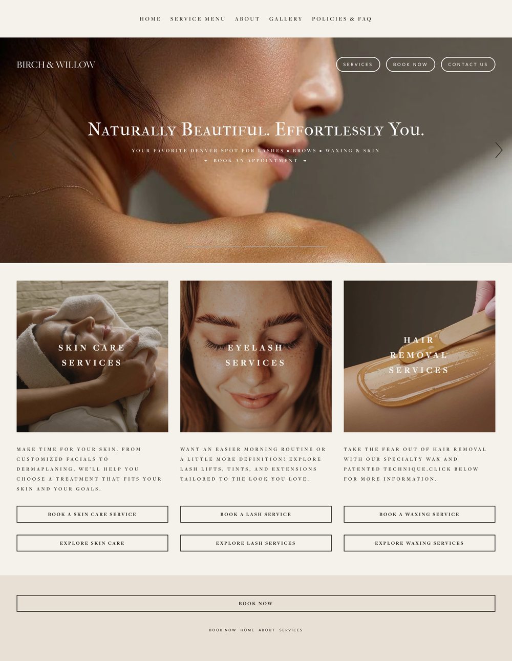
Birch & Willow Beauty Co. · Denver
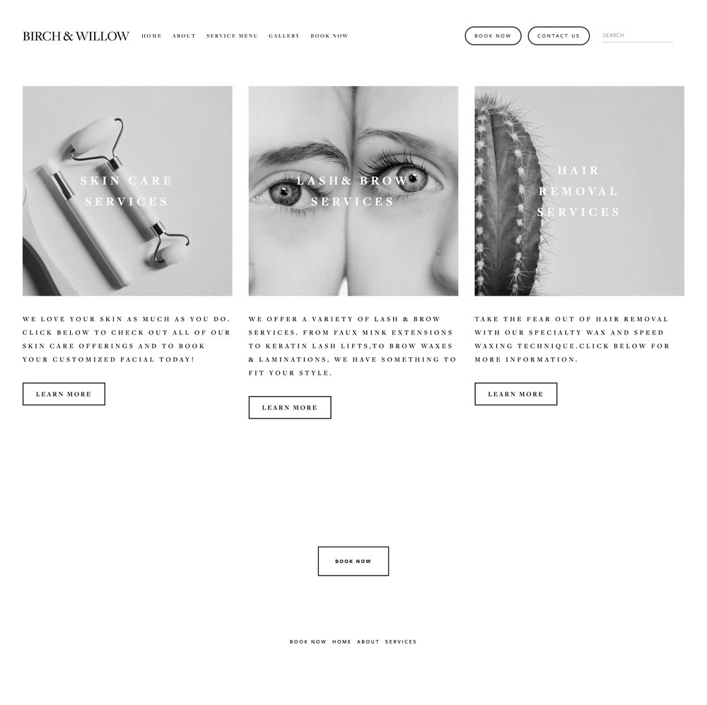
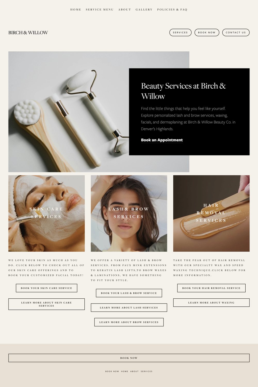
The old homepage opened on a mountain and a mood. Lovely, and it never said what the studio did: three grayscale tiles, one Learn More each. The new one names it in the first breath, your favorite Denver spot for lashes, brows, waxing and skin, then describes real treatments in plain words and gives every service two ways in: book it, or read about it first. Same quiet luxury, same owner, now legible to someone deciding at eleven at night.
one service, two ways in
Before
After
The service tiles · Birch & Willow
Before: a jade roller, a cactus, and three identical Learn More buttons. After: an opening that says what Birch & Willow does and where, lash and brow services, waxing, facials and dermaplaning in Denver’s Highlands, with real treatment photography and two buttons per service so the person who is ready can book while the person who is nervous can read first. The brand did not change. The questions it answers did.
from booking link to website
Before
After
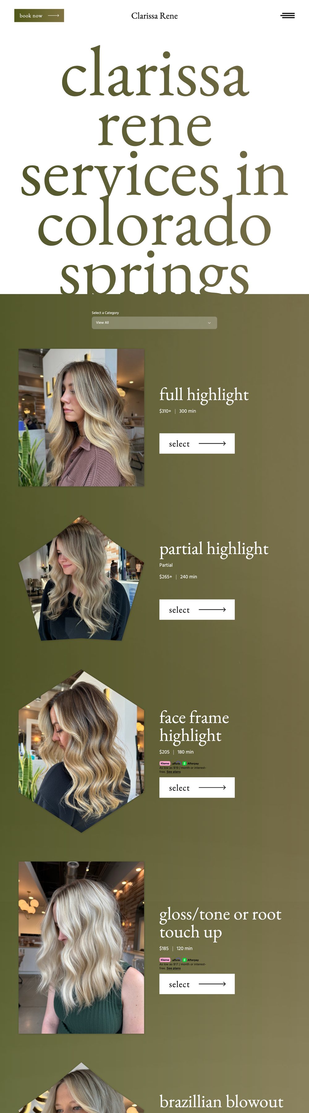
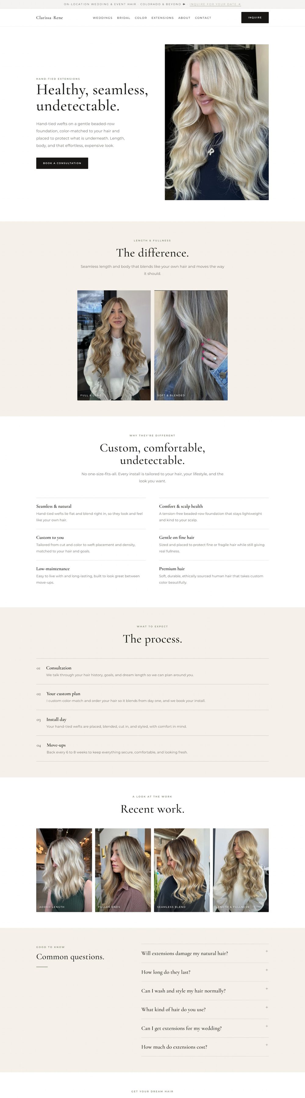
Clarissa Rene Hair · Colorado
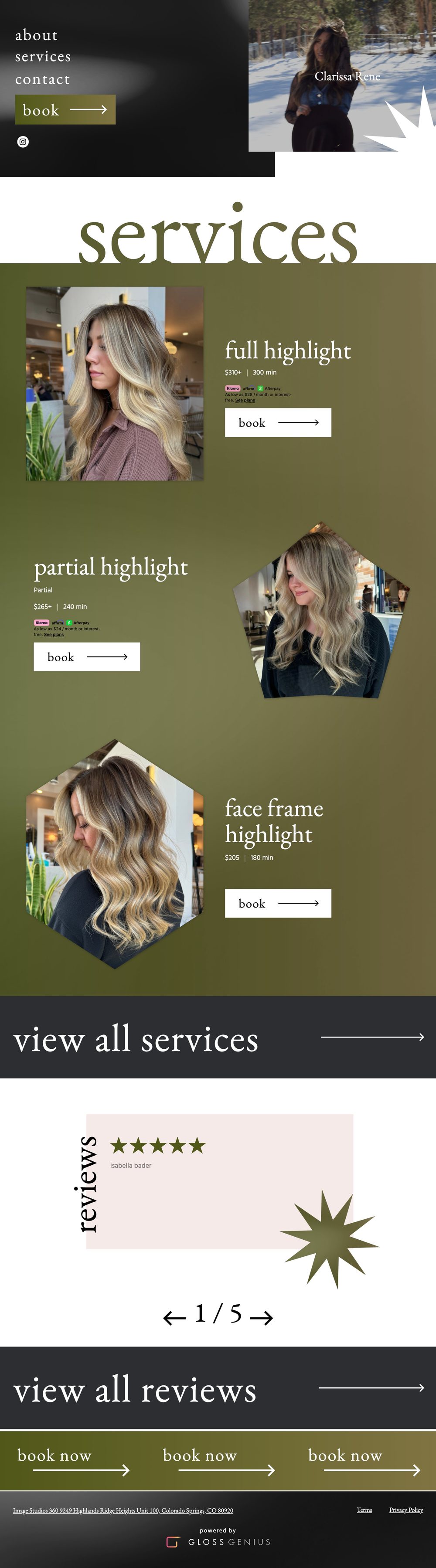
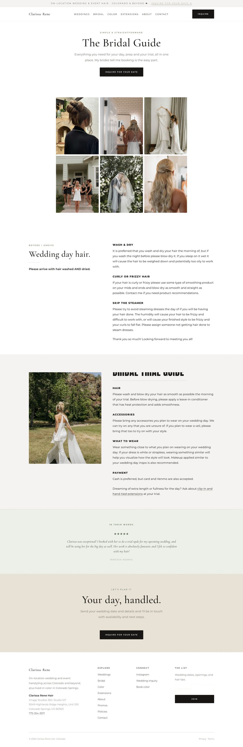
Clarissa had built a beautiful bridal business through Instagram and a GlossGenius booking page. Brides could see her work and book, but nothing explained her services, her pricing, what a trial involves, or what it would feel like to have her there on the wedding morning. The new site answers all of it, in her voice, before the inquiry.
one service, one page
Before
After
The service menu
Before, every service was a line on one page: a name, a price, a button. Now each one has its own page that explains what it is, who it’s for, what happens at the appointment, and what to ask. That’s the page Google can rank and the page a new client can decide on.
Ready when you are
Want to see what yours would look like?
Tell me what’s going on with your website. I read every note myself and reply within two business days.